July 23rd, 2025

{ Design }
Developing a custom functional typeface for Cowrywise.

Dara Fakoya
February 2024, I took on the task of creating a typeface for us to use on both digital and traditional materials. It took about 6-9 months to complete. I learnt a lot during this period and it stressed me out, but I came out alive.
We wanted the update to be covert, so we maintained some similarities (in geometry) with the former typeface, BR Firma.
These were my tools.
- Pencil and paper to sketch
- Glyphs app to illustrate and encode (in hindsight, I should have used Adobe Illustrator to create the high fidelity illustrations)
Here’s a breakdown of how we eventually created that typeface.
Sketching
This part was pretty straight forward. Since we wanted it to silently replace BR Firma (our old typeface), I had to study BR Firma — its width, geometric appearance and other details. Using it as a reference, I sketched out the most alphabets and made some adjustments to how some characters looked.
Illustration
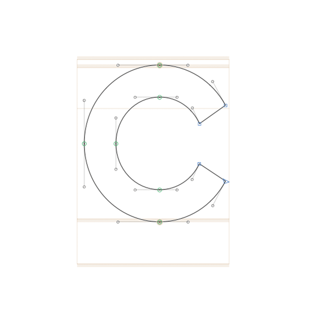
After sketching, I headed straight into Glyph’s app to create high fidelity characters(alphabets, numbers and punctuation). The biggest problem here was having consistent looking strokes for each character…so I had to do a lot of manual adjustments.
Spacing
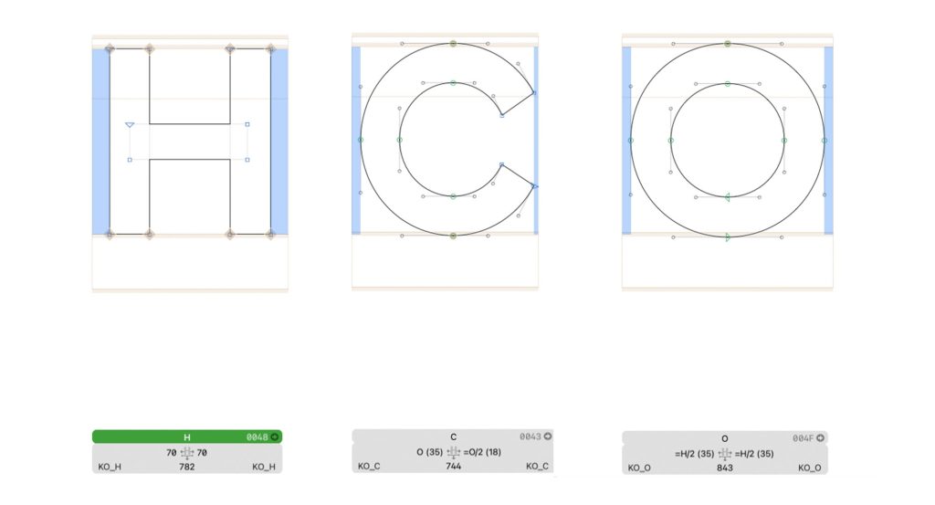
This was probably the most straightforward part of the entire process. The major thing to consider here was the anatomy of each character. You’ll generally assign more spacing to the straight-vertical sides and less to the curved sides of any character. For characters like A and V, you’ll add even less. Technically, these are called side bearings. There are a lot of tutorials that address this on Youtube.
Text Proofing
This blog post by Hoefler&co helped a lot on where and how to start the kerning process. This article is just for basic proofing and was the foundation for everything else that followed
Kerning
Now, this part was the most troublesome. It probably cost 60 – 80% of the entire time it took to create the typeface. Kerning is basically setting individual spacing for different character pairs. This meant I had to do it manually for each character pair— over 3000 pairs.
- Manual Kerning
At this point I didn’t know better. I had designed a display typeface in the past that didn’t require any kerning and thought this would be that straightforward too. Boy, was I wrong. Before long, I realized this wasn’t sustainable… I mean, every now and then, Ed or Razaq would ask about it. So, I had to find another solution.
- Bubble Kern
This was my second option. I watched this video by Toshi Omagari. Bubble Kern essentially requires you to draw shapes around your characters. Where these shapes collide determines the kerning value for each pair. To be fair, this sped up the work flow a little bit, but a lot of the work still felt manual and time consuming and that was time that we didn’t have. I mean…I would have loved to figure it out but onto the next option.
- Steal Kerning from Illustrator/Indesign (Mekkablue Scripts)
When I found this on Github, I was immediately excited. If you know anything about Adobe’s optical kerning, you know that it’s amazing. In my naiveness, I went looking for ways to apply optical kerning directly on my typeface. I soon learned that it wasn’t available to the public but that I could ‘borrow’ it for the typeface I was building. This didn’t last long though. It turned out that it only worked on Adobe products. On Figma, the kerning was still scattered. I remember Chima Ataman helped me with making this script work because I didn’t understand anything about python.
- KernOn
This was the life saver. After many months of labouring, when we had Joboson Chisa over for UnderTheHood, he recommended KernOn… and I must say kudos to Tim Ahrens for this tool. It really cut the kerning time short. A large part of the work became automated. From understanding how the tool worked to actually using it, I think it took about 2 weeks to have the font we now use today across digital and traditional platforms.
- Naming
I’m pretty proud of this one. Our identity for a while now has been around money, so I tried to reference that in the name too. So I extracted ‘Rency’ from currency.
Aside:
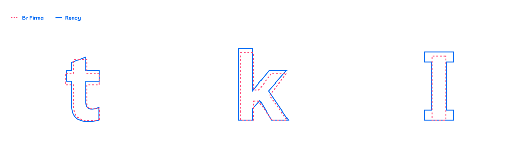
We made some divergent choices, most notably to the ‘I’, ‘k’ and the ‘t’ and
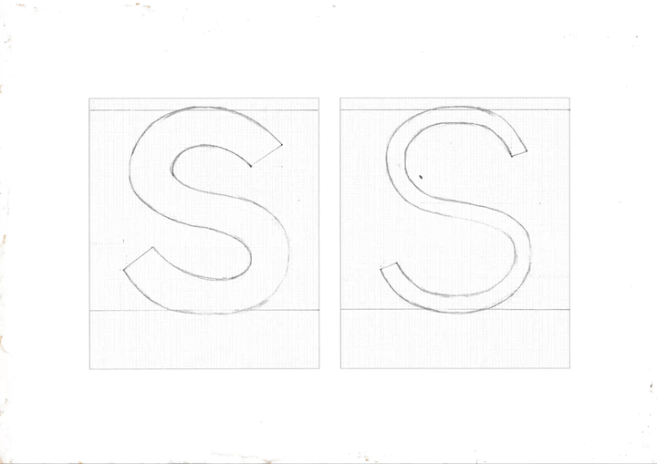
The most troublesome letter to illustrate was the ‘s’ because of the curve, certain nuances with contrast and the difference in width between the upper and lower part of the character.
Shoutout to Feyi (especially for upward mgt), Tiana, Adimchi & Obasola for the criticisms, feedback and the testing they did. They made the entire process worthwhile.
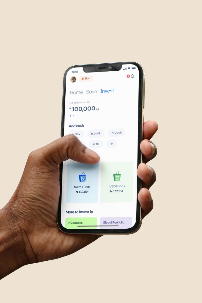
Here are some use cases.


Next article

Chima Ataman;
{ Team Lead Infrastructure } Cowrywise