

Imagine having to redesign the entire product every time an update is needed. That doesn’t sound fun, right?
Products grow, evolve, and sometimes change direction entirely. As designers, we must consider this early in the design phase to ensure that our design remains relevant as the product evolves.
When is a design scalable?
A design is scalable when it can effectively adapt, expand, and evolve to meet the changing needs of users, devices, and content without compromising quality or performance.
Importance of having a scalable design.
Consider this scenario
Three months after the completion of the design…
Product manager: “Hey, Designer. We’re thinking of adding a new section to your design.”
Designer: “A new section?”
Product manager: “Yeah, it should be a quick addition to what you’ve already done, right?”
The designer heads back to Figma to assess the request.
Designer: “Um, I created the design with only one section in mind. Adding a second one would ruin the flow. To make it work, we’ll need a complete redesign for that.”
Product manager and other stakeholders: 😧
This scenario illustrates one of the issues that could arise when designs aren’t scalable. Here’s a couple of reasons why it’s crucial to design for scale.
- Speeds up the design process.
- Shows the reliability of both the design and the designer.
- Produces more consistent and coherent designs.
Tips for designing more scalable products.
Design reusable and flexible components.
When designing components, consider how you intend to reuse them. Do you want to maintain the same style everywhere? Do you need the components with different states, or do you want them to vary depending on where and how you use them?
By asking these questions, you cater to possible use cases that may come up when the product evolves.
The example below shows three notification styles for three use cases: informational notifications, actionable notifications, and celebratory notifications.
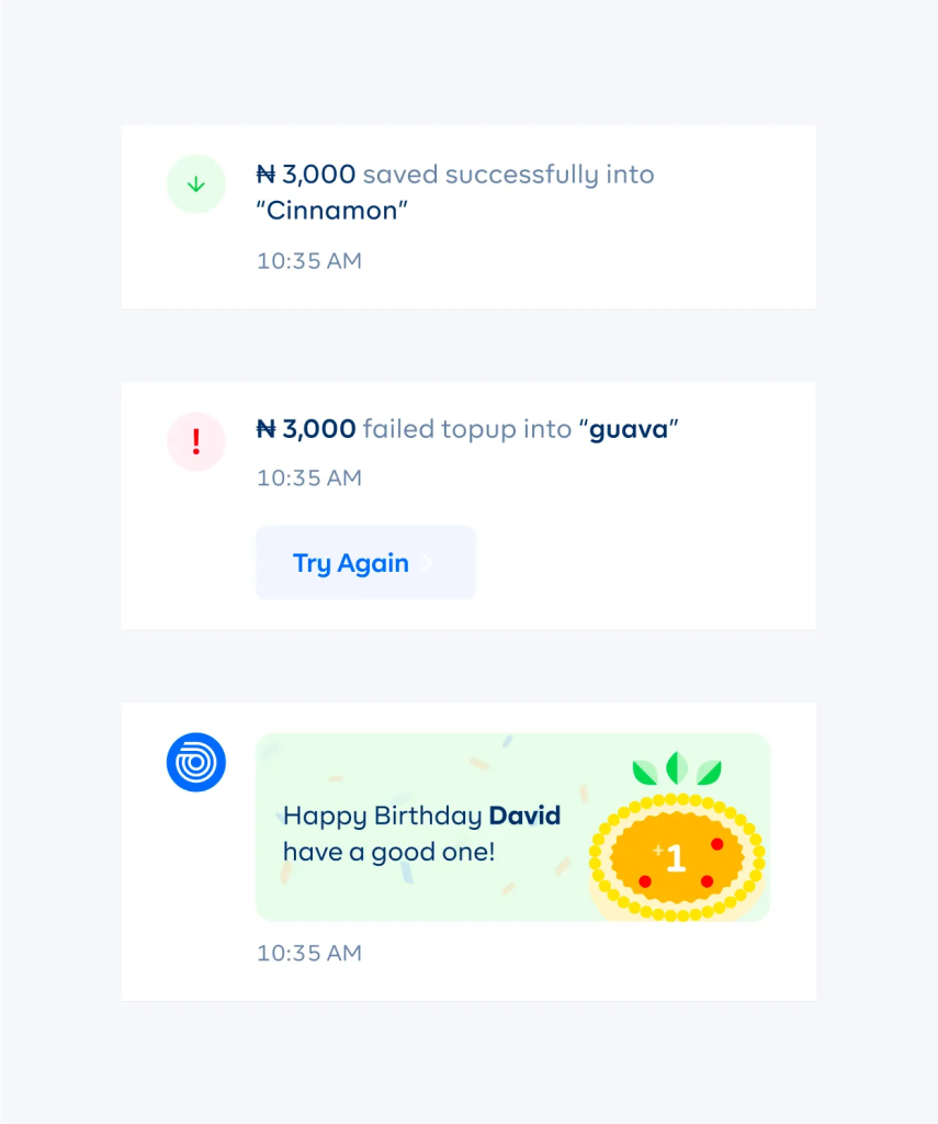
It’s one notification component with variants that work for various instances. It is unlikely that future notifications will not fall under these three categories.
Make room for growing content.
When designing, pay attention to how content will affect the design. Sometimes, we design with a small content size in mind, failing to adequately cater to larger content sizes. A good rule of thumb is to try out how the design would look with small and large content sizes.
In the example below, the design at the top works well with a smaller amount, but once you have a more significant amount, the design is compromised.
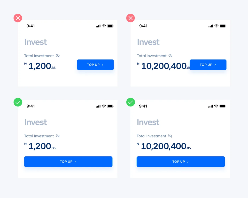
The design on the bottom works better because the values can grow without compromising the quality of the design.
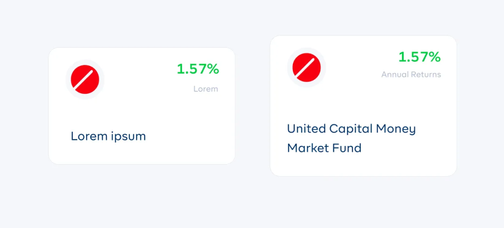
Also, design with real copy. Placeholder text often gives a false perception of the amount of space that you need in the design.
Finally, ask questions.
As with anything else in design, having proper context is always helpful. If you’re not clear on whether certain parts of a design could grow, you could always ask the project lead or colleagues involved in the project.
Next article

Chima Ataman;
{ Team Lead Infrastructure } Cowrywise